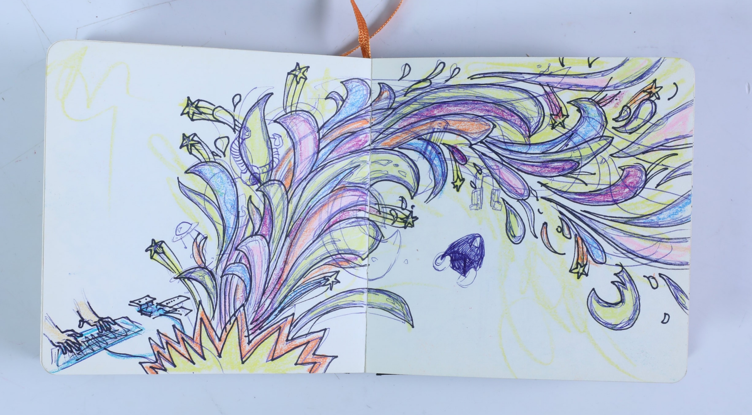
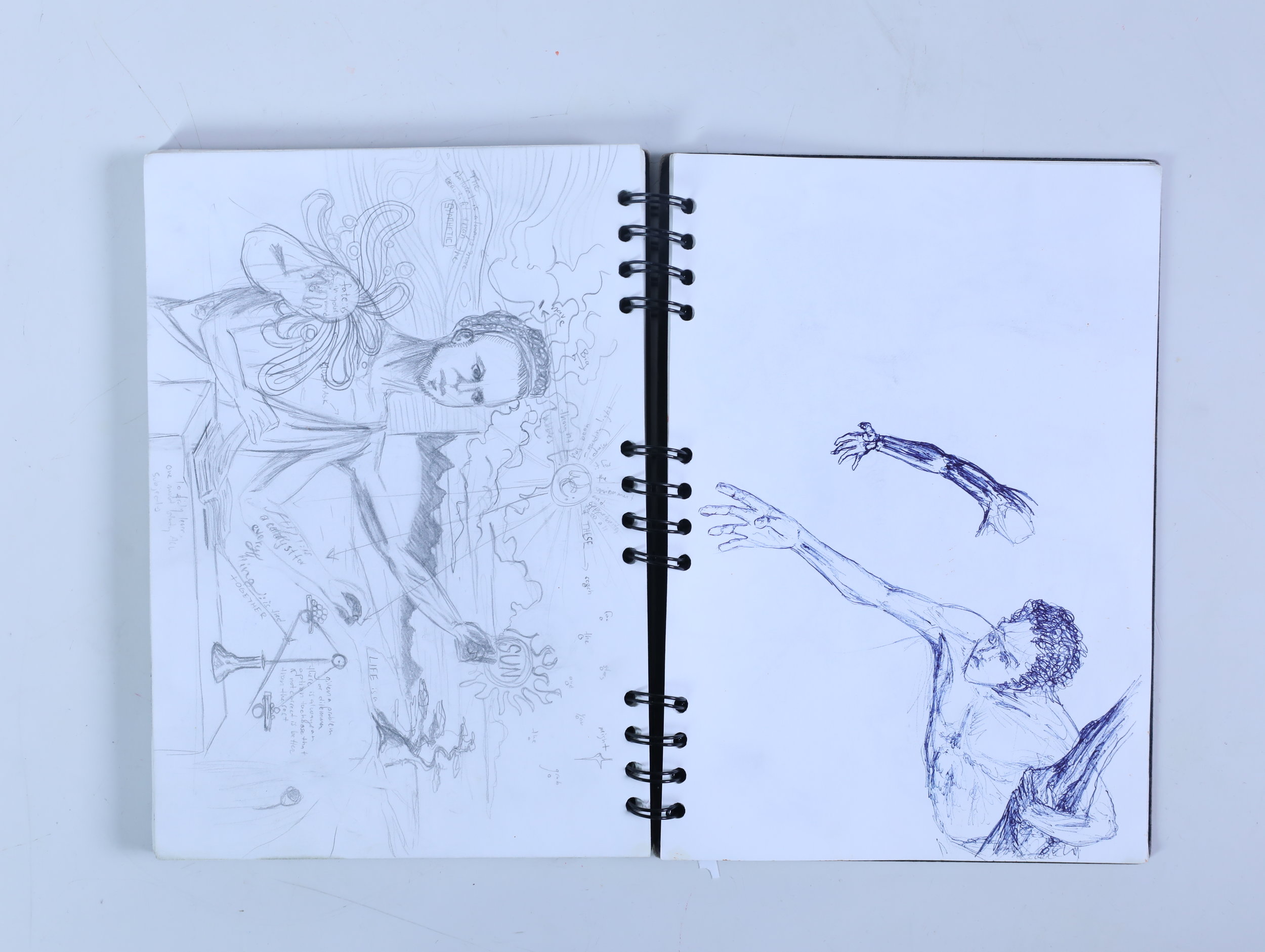
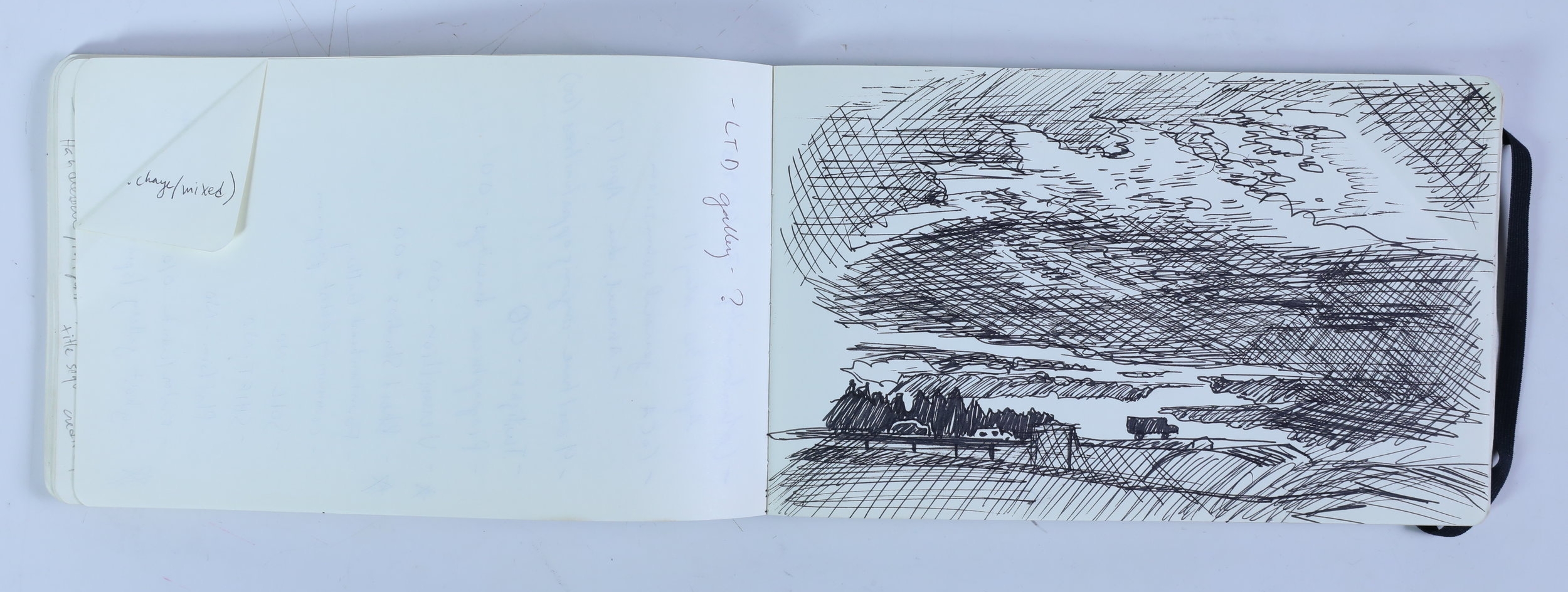
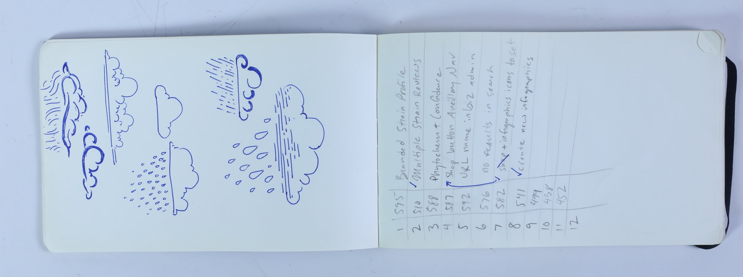
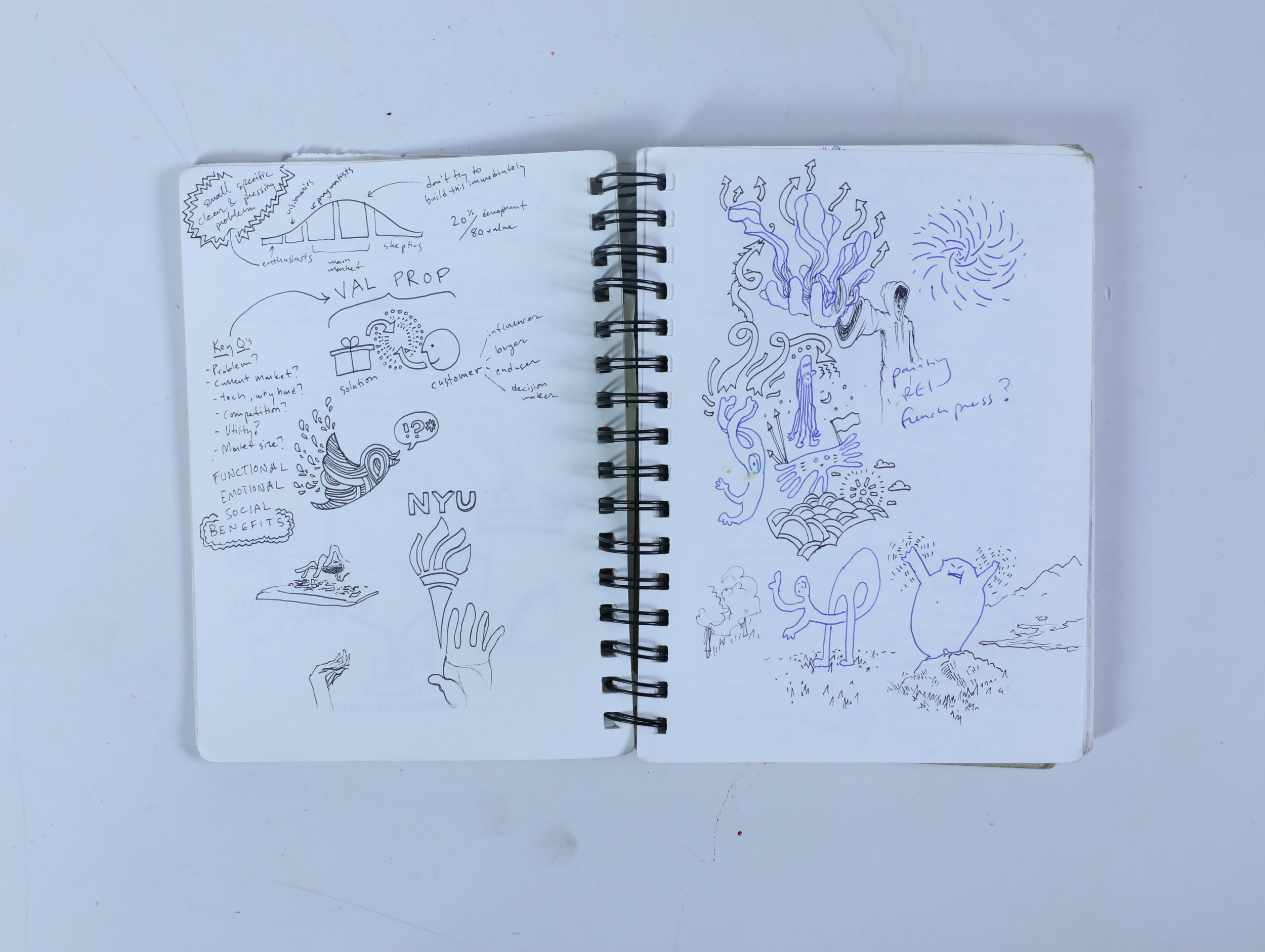
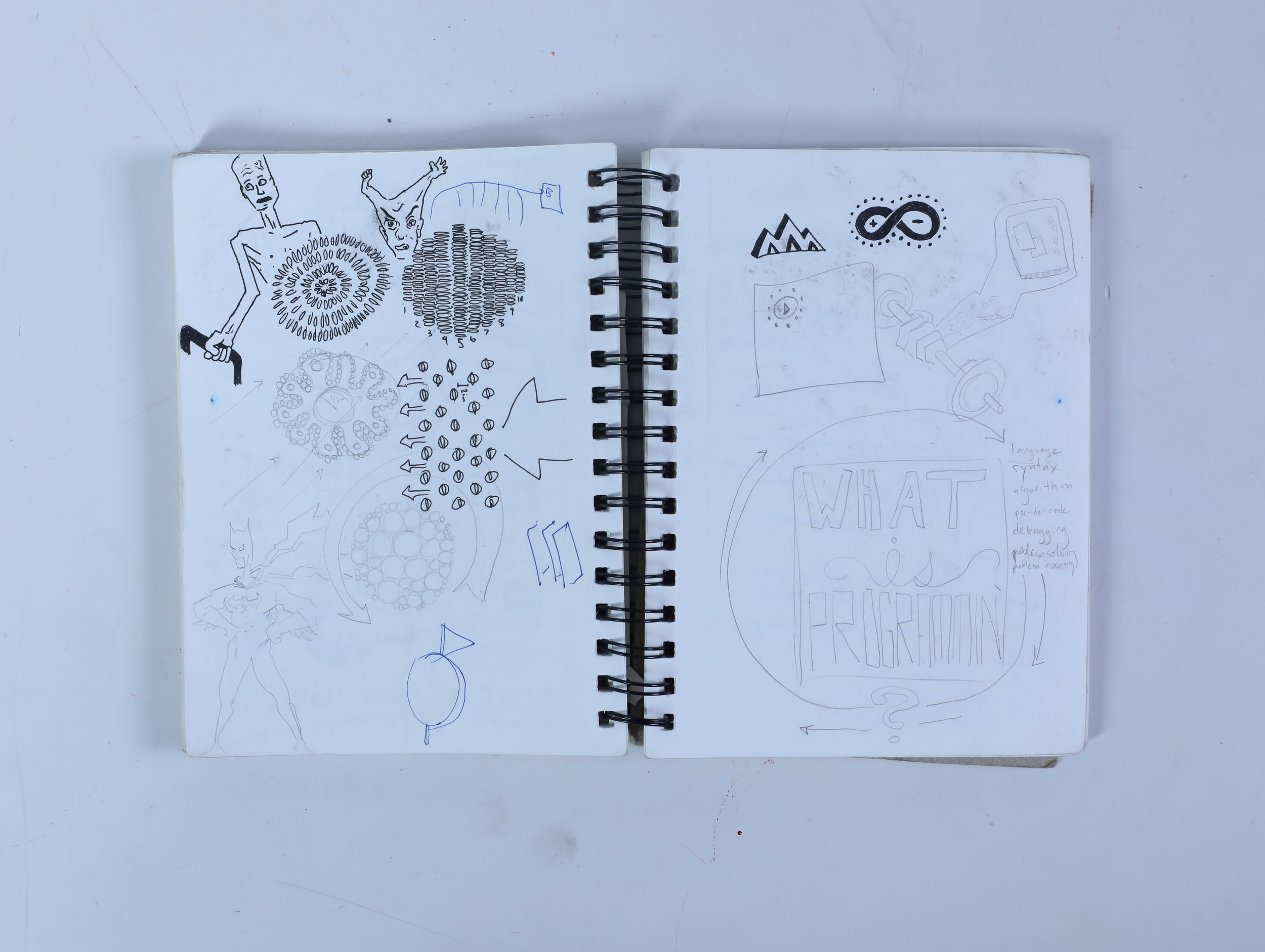
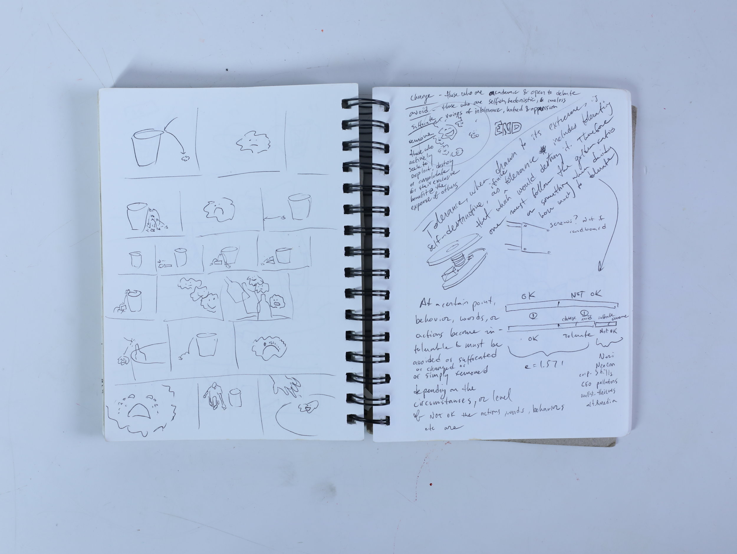
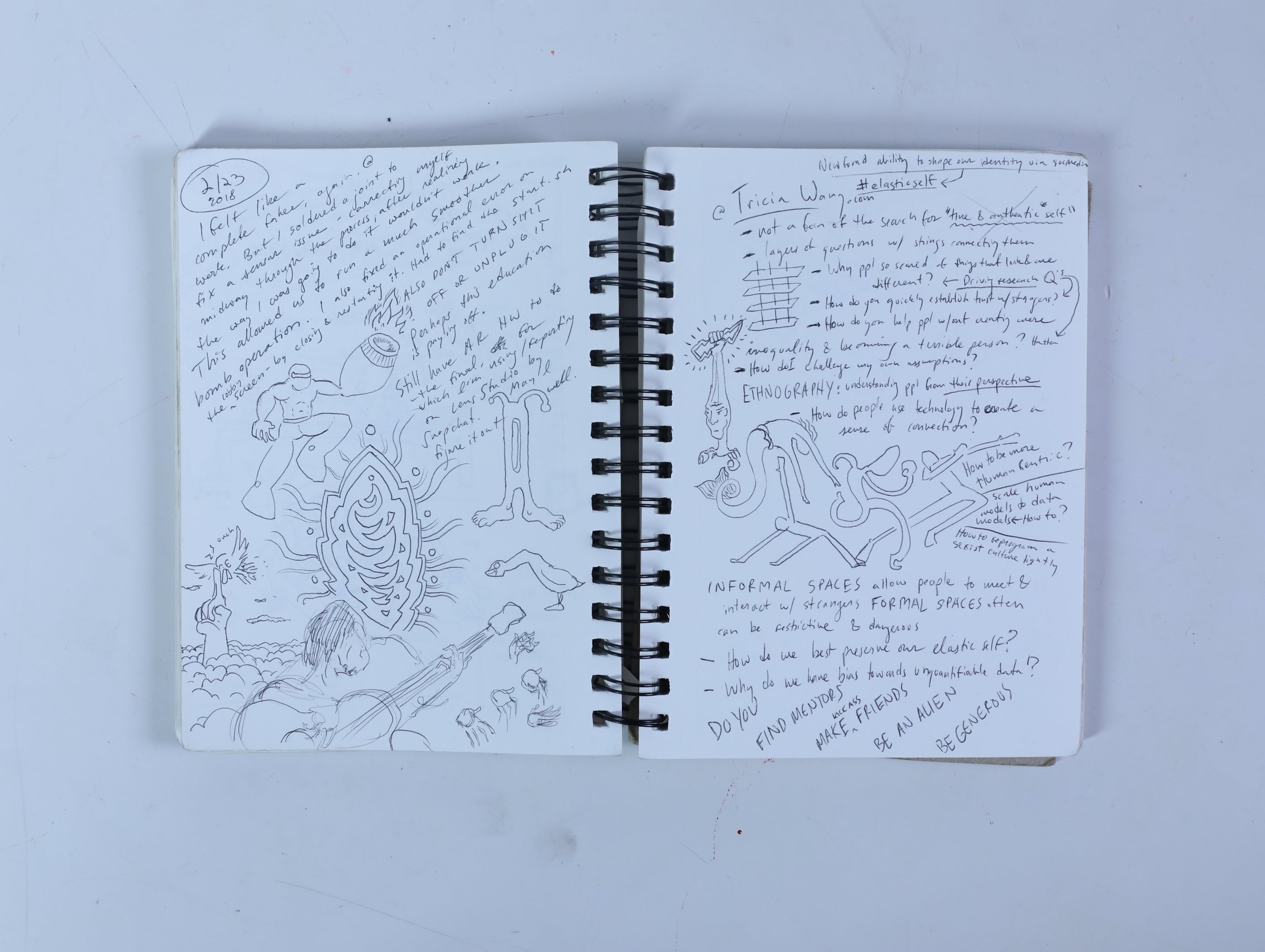
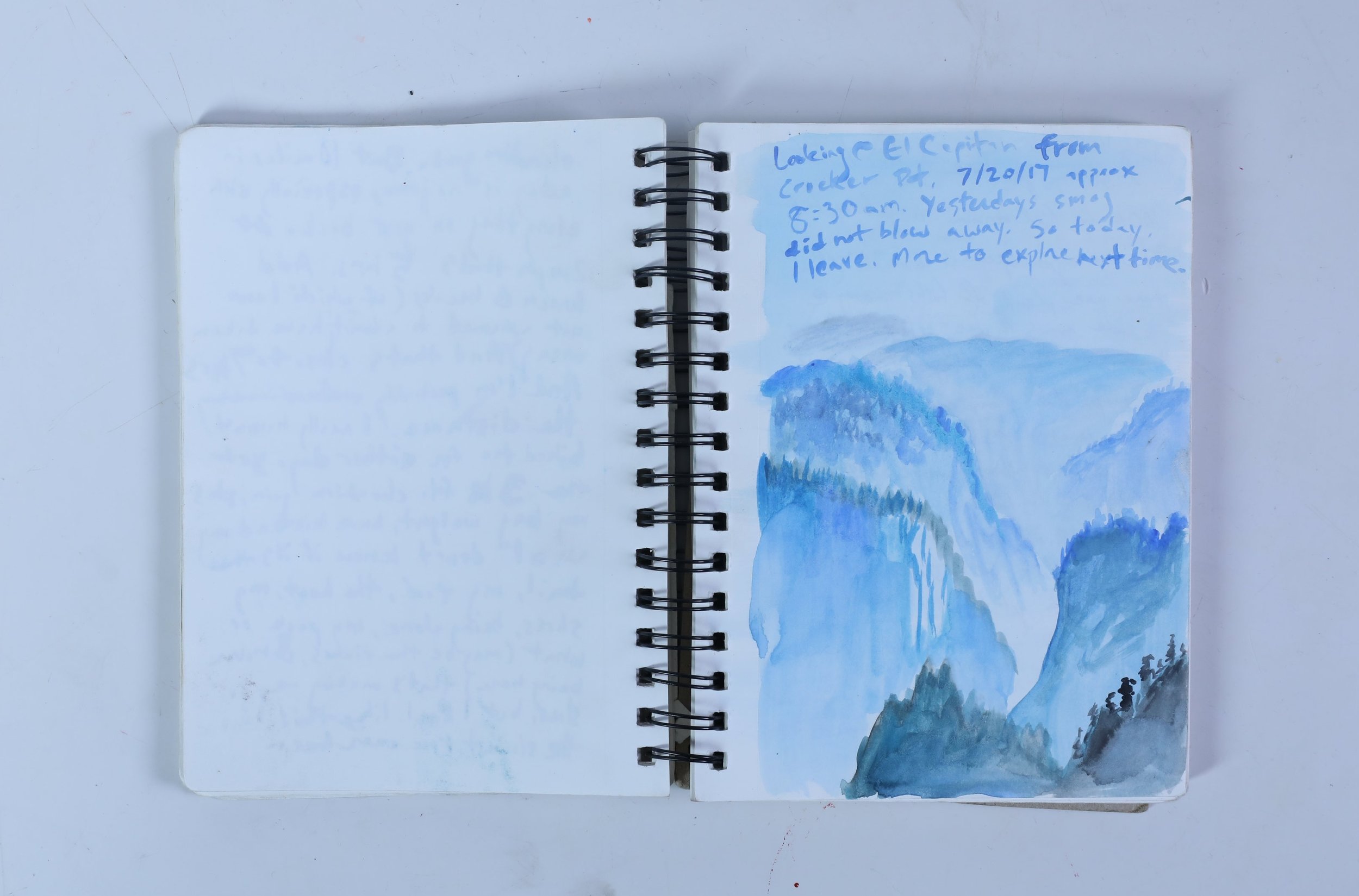
For this assignment, I had a hard time determining what data set to use. Initially, I wanted to asses my personal health using MicroLife points, but eventually quit on the idea once I realized I both didn’t have enough time to do the project properly - it’s a project that depends on grounded research and dry observation. This felt a little unfun, especially since the project was so personal. For the same reason I wanted to do a more qualitative assessment. At the moment I was pondering this idea, I noticed that I had four nearly full sketchbooks that I’d held on to for the past several years. I decided to do something about them.
My methodology is simple - each page can have up to 3 dots, indicating the type of data on the page, and those dots can be smaller or larger, depending on the amount of that type of data. If the content spreads over two pages, such as a two page drawing or super large text, then the dot becomes more like a pill, spreading over two lines. If no content is on the page, a black line represents the absence of content. If content is related, such as a list or a diagram, then a green line connects those dots. Finally, if there is content that is cross or scribbled out on the page, then a black line strikes through that dot.
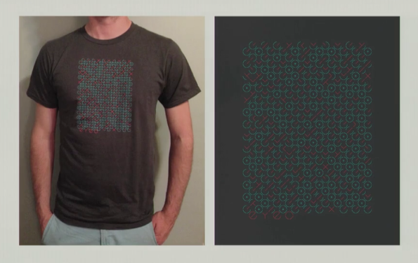
I was inspired by Dear Data, and by the t-shirt design presented in this video (15:25). Using data as an ‘Easter Egg.’
INSPIRATION
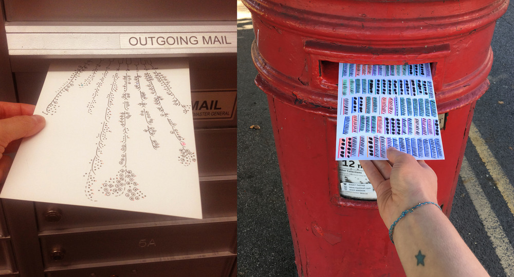
Dear Data was an analog data art project undertaken by a few designers on either side of the Atlantic sending postcards back and forth.
The Eyeo 2013 t-shirt was made from data taken from participant tests. The test had to do with moral integrity in the workplace.
That data has driven this work, namely what kind of content is on my sketchbook pages, is not clear from looking at the final piece, but it is an interesting art piece, made from data about art.
My first draft, below, included some post analysis. The final draft is above.


