WEB
Creative storytelling through interactive media
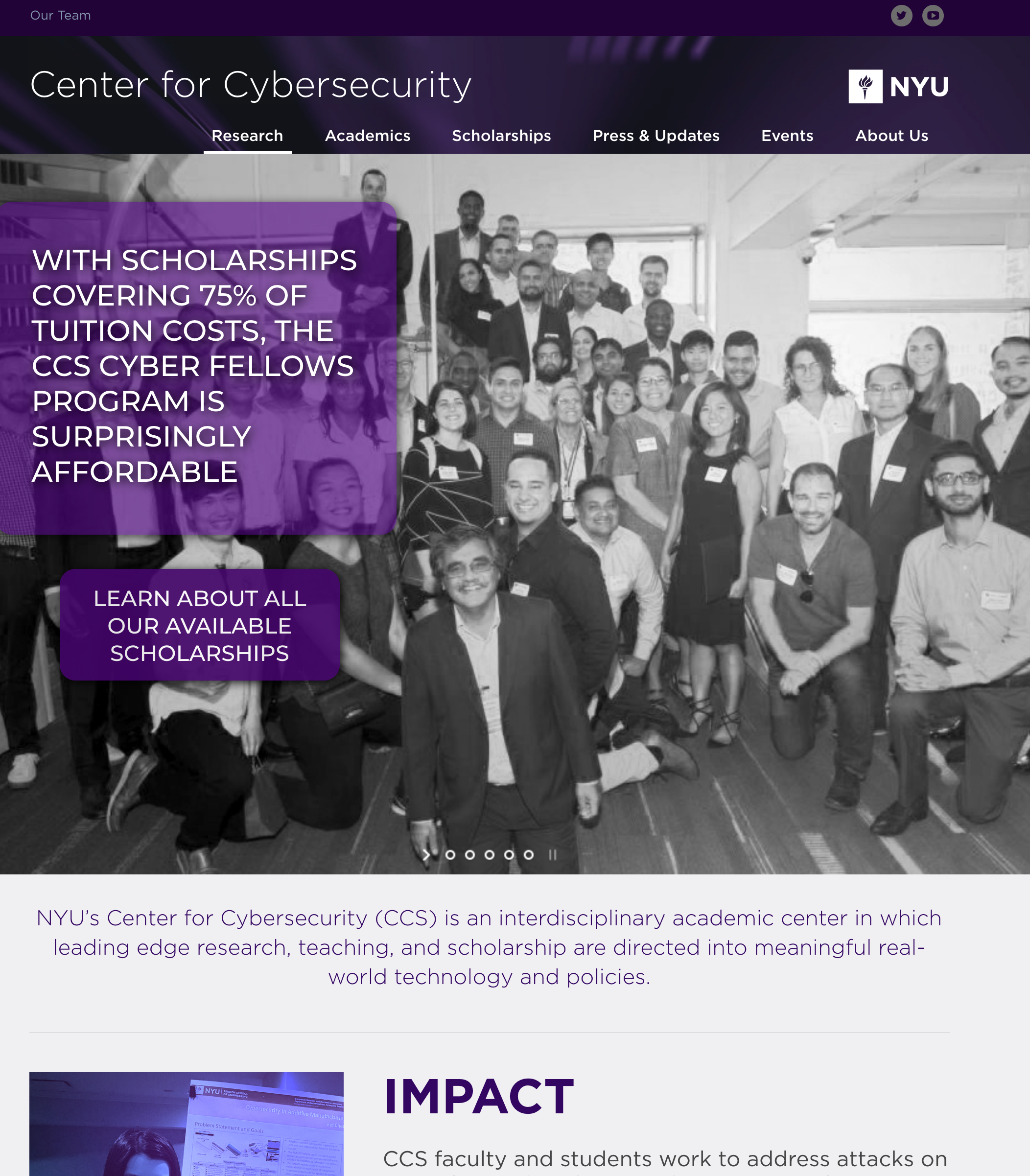
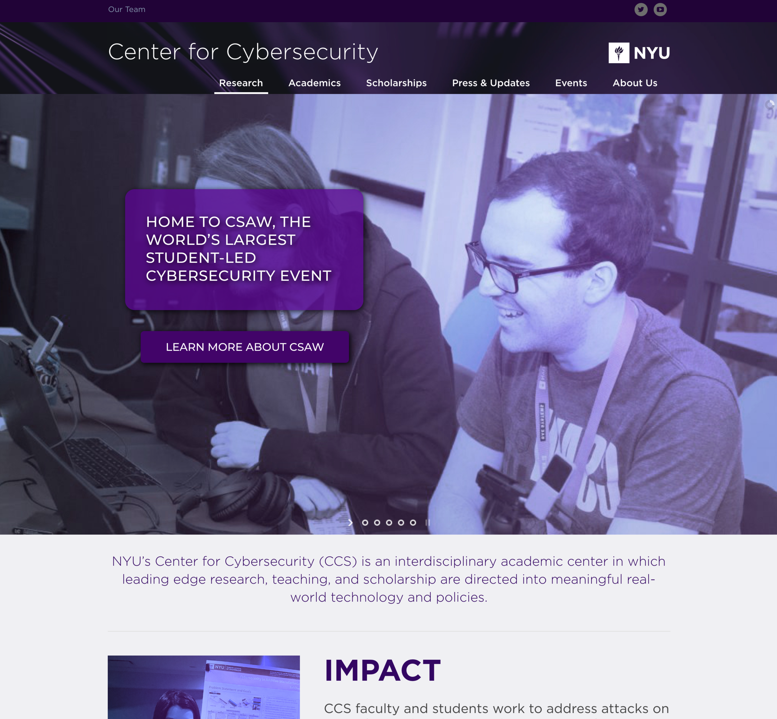
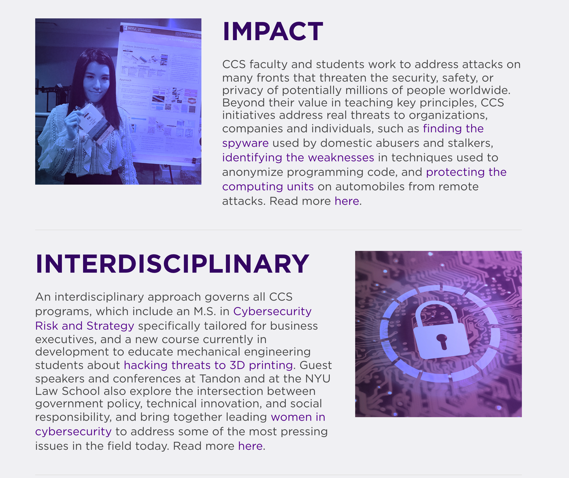
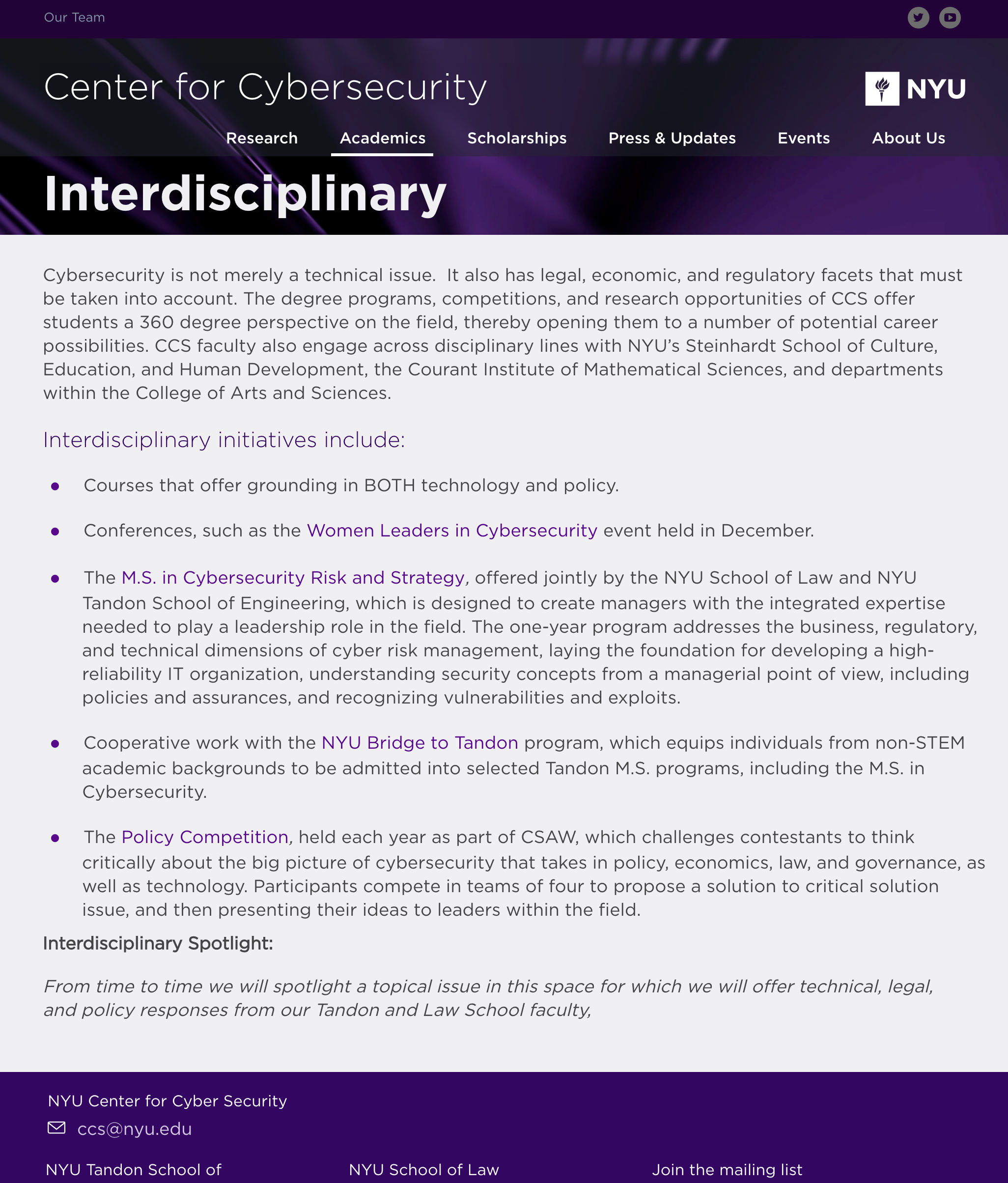
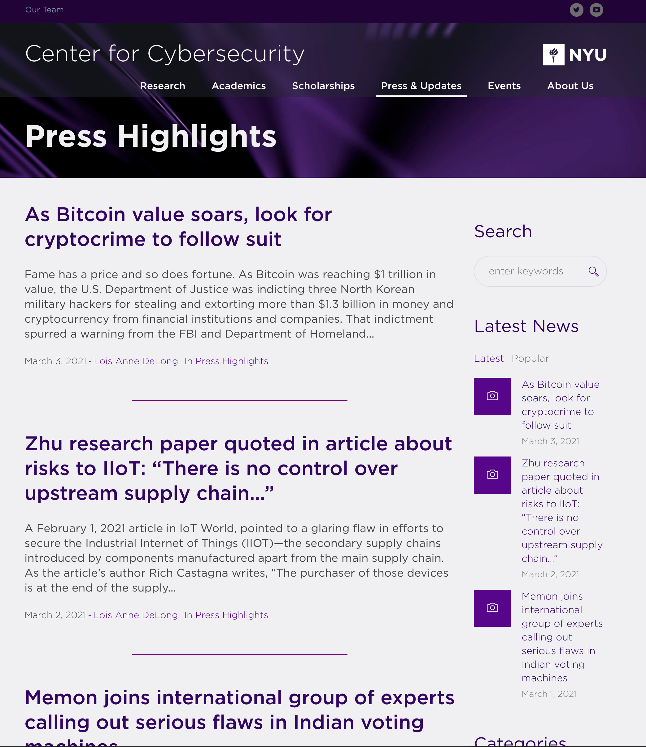
NYU Center for Cyber Security
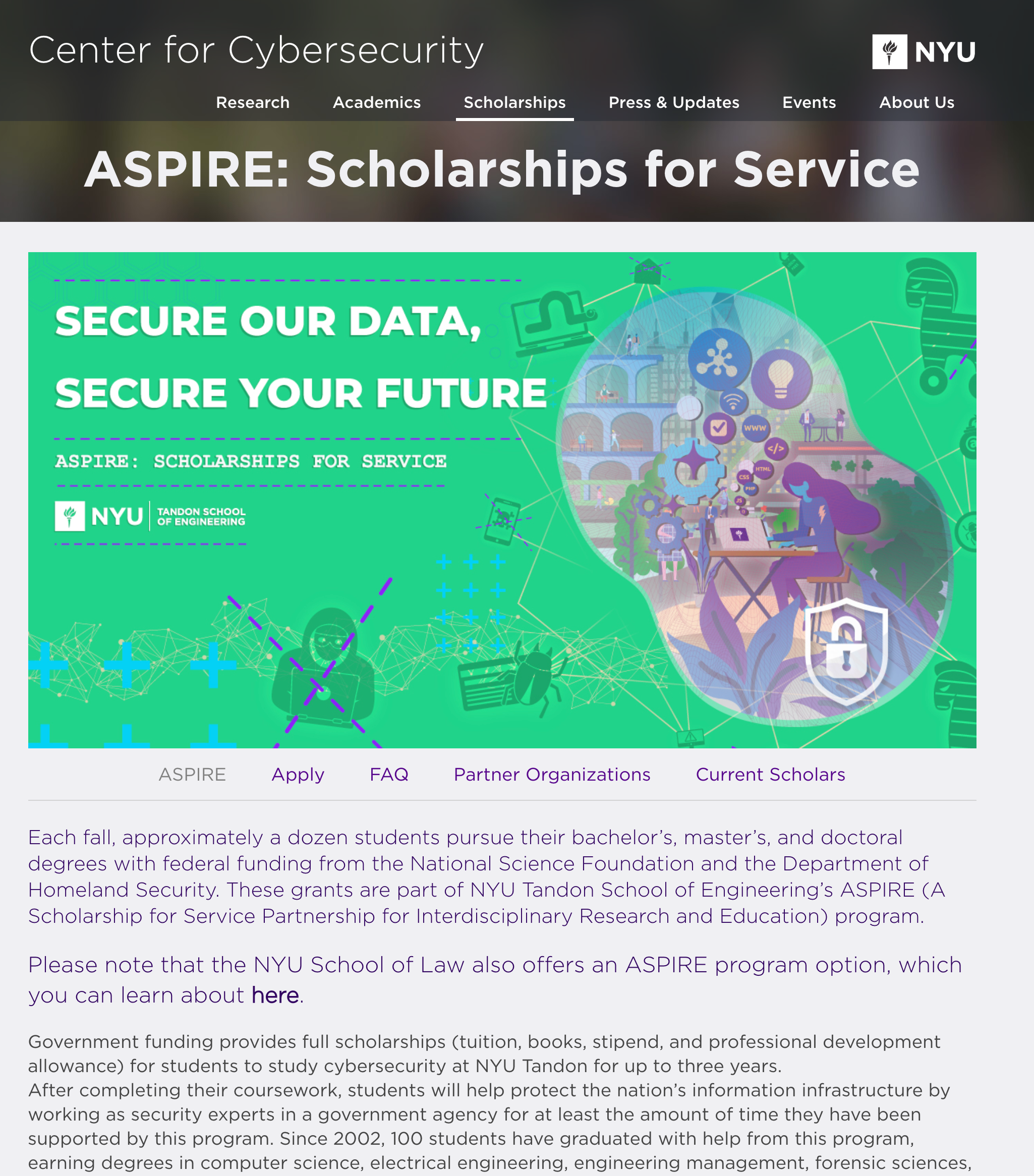
I was asked by my boss at Tandon Online if I could help update the NYU Center for Cyber Security Website. I of course said yes. What followed was several months of work, continued iteration, and a great portfolio piece. I also did the design work for the ASPIRE page.
What Is News?
That's the burning question we had to answer to design this site (currently in construction), as well as the name of the actual e-zine itself. This is a publication dedicated to discovering and relaying those pursuing their own creative ends in their own styles - meaning a simple, clean, modern design aesthetic that allows the individual content to shine through, unfiltered, unadulterated.
Any modern layout MUST be flawless across all devices - no easy task.
Each piece takes the reader behind the scenes into the creative process.
Photo heavy themes require little to no additional design.
Mobile mockups are a great boon to any presentation.
Handlebar Media
Is a big idea. One that will take at least a few years, maybe 5 to 10 to really develop into something with staying power. But that didn't keep me or my business partner from getting started. From simple sketches and draft concepts to a complete responsive template, we were able to establish ourselves as capable producers, and take initial steps towards success. Now with the company firmly in existence, we are building a portfolio and market traction little by little.
Again, responsive layout it King these days, anything less is just bad.
Organizing the UX/UI so that it presents the best identity possible.
Final layouts of homepage slider images, highlighting our offerings.
An initial draft of the website, very simple, not interactive. Basically a postcard with active contact buttons.
Lion's Head Foods
I created the graphic content for this site (which eventyally became The Meat Empire) and worked with the same developer here as I did for the Handlebar Media project above, resulting in a fun and engaging theme that makes you feel HUNGRY! I also created all the product photography, as well as the logo and packaging.
Client requests determined we use an Amazon webstore theme
Each product has multiple sizes, but all have similar descriptions.
Simple presentation of products - Biltong with variety, & Droe-Wors.
I took all product shots for the site, here's a glamour shot of all products.

